Steal the Vibe: Ditch the Pin-Up Clichés for the New Moody, Asymmetric Dot Trend
Polka dots are having a moment, but not the retro-sweet way. The latest red carpet moves prove dots work best when they're unbalanced, dark, and strategically unsettling.

The polka dot has undergone a radical reinvention. Gone are the wholesome, spread-evenly-across-the-dress iterations that dominated early 2000s nostalgia cycles. What's replacing it is moodier, more architectural, and infinitely more interesting: asymmetric dot placement on deep, shadowy palettes that reads less Audrey Hepburn and more editorial haute couture.
The Anti-Symmetry Shift
Recent red carpet appearances prove that the new dot era demands tension. Designers are clustering dots unevenly across bodices, concentrating them on a single shoulder or hip, leaving entire swaths of fabric bare. This asymmetry does something strategic: it turns a traditionally cheerful, innocent print into something with real presence and edge. The dots become sculptural rather than decorative.
Think charcoal silk with white dots concentrated in a diagonal slash across the collarbone. Or navy crepe with scattered black polka dots that favor the left side entirely, creating an almost unsettling visual weight. It's the difference between a vintage sundress and a museum-ready installation.
The dots become sculptural rather than decorative—a statement about silhouette and negative space, not whimsy.
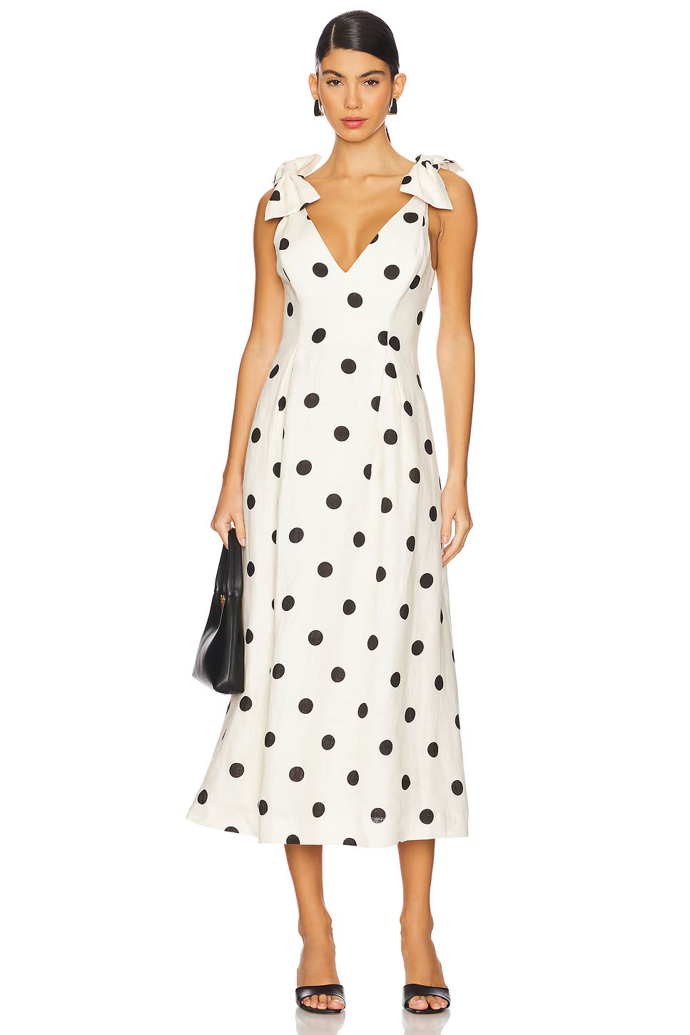
Zimmermann Crush V Neck Midi Dress
The Color Palette That Changed Everything
The shift away from bright, primary-color bases has been fundamental to this trend's credibility. Black dots on chocolate brown. White spots on deep burgundy. Charcoal on forest green. Even silver metallics on near-black fabrics. These combinations read sophisticated precisely because they're the opposite of what nostalgia-driven fashion typically reaches for.
The moody palette also solves a problem that plagued earlier dot trends: they felt costume-y, locked into a specific retro moment. Wearing dots on dark, rich fabrics feels contemporary because it sits somewhere between playful print and serious tailoring. It's easier to believe a luxury house created this intentionally rather than it feeling like a throwback exercise.
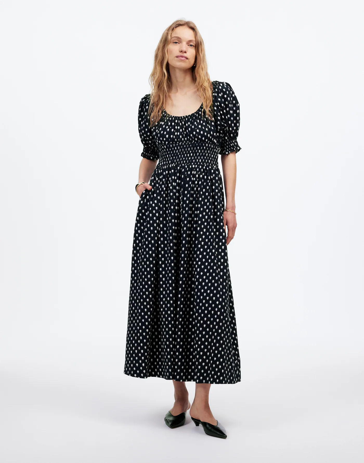
Madewell Smocked-Waist Midi Dress in Shibori Dot Print
How to Steal This Without Looking Costumey
Favor asymmetric placement over all-over patterns—buy pieces where dots deliberately favor one side or cluster at a focal point
Stick to dark base colors: charcoal, navy, black, deep plum, forest green. Avoid pastels and bright backgrounds entirely
Mix in matte and shine—pair a matte dot jersey with a glossy satin finish on the same piece for dimensional intrigue
Pair with sharp tailoring—structured shoulders, clean lines, and minimal embellishment elsewhere keeps it editorial rather than kitschy
Layer strategically—a dot-print slip under a sheer overlay or oversized blazer adds mystery and prevents the look from reading too literal

Posse Paloma Polka-Dot Cotton Maxi Dress
Why This Works Right Now
Fashion has spent the last few years caught between genuine vintage admiration and pastiche. The asymmetric, moody dot represents a third lane: print that feels retro in origin but modern in execution. It's decorative without being cute, bold without being literal, and distinctly editorial.
The red carpet is where you see trends calcify into meaning. When this many high-profile dressers and designers are gravitating toward asymmetric, darkly-toned polka dots simultaneously, it signals something. It's not nostalgia anymore. It's a genuine aesthetic shift toward tension, toward silhouettes that earn their geometry, toward prints that require intentional placement.
The old polka dot was democratic, cheerful, accessible. This new iteration is deliberate. That's how prints evolve from trend to language.